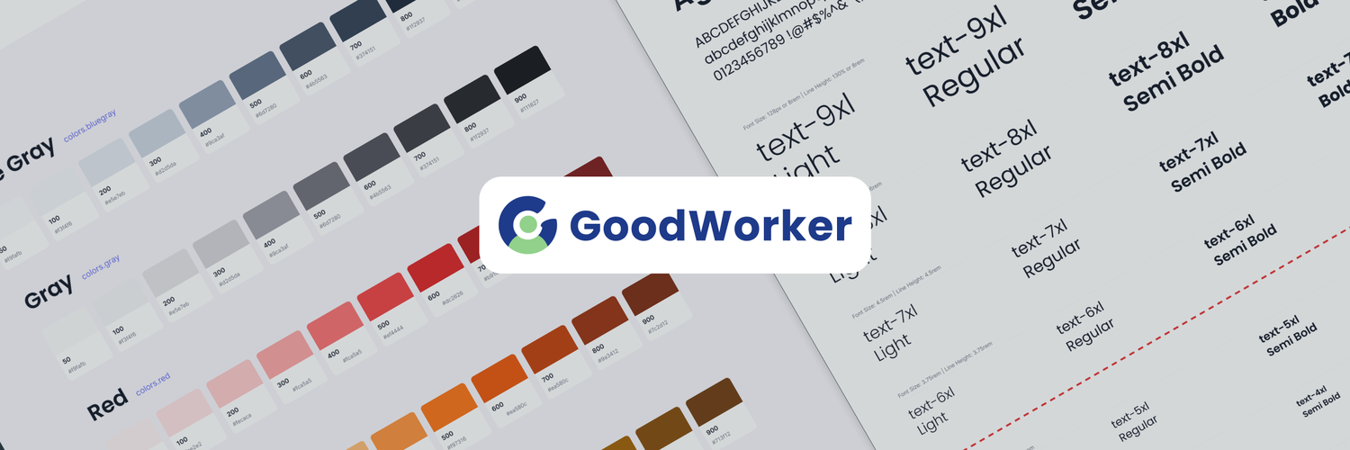
notion image
 

What is GoodWorker?

GoodWorker is a joint venture between SchoolNet and LemmaTree (100% subsidiary of TEMASEK). Focused on becoming India’s largest full-stack, blue-and-grey collar recruitment and learning platform, GW is a unique combination of a hungry tech startup with a genuine social impact agenda.
GW’s ‘moonshot’ mission includes impacting the entire blue-collar workers’ ecosystem (jobs, learning, finance, insurance, and housing) by creating unprecedented value through next-gen tech. Integrated play.

What was my role?

When I started at GW, my mission as a platform designer was to bring coherence and consistency to the design work across the GW Worker and GW Employer apps. We aimed to establish a design system that would unite designers in terms of aesthetics and vision. It was more than just creating a UI library; we needed to align our ways of working, establish processes, and foster a shared vision. Together, we embarked on this journey to harmonize our efforts and create a seamless user experience for our users.

The challenges we faced

  • GoodWorker began as a brand-new startup, leading to a dynamic and unpredictable journey.
  • Daily experiences were filled with constant changes and challenges, requiring the team to adapt swiftly.
  • Shifting business requirements necessitated the need to reprioritize tasks regularly.
  • Design work often felt disjointed from the user experience, prompting a call for alignment and collaboration.
  • The mission was crystal clear: unite everyone, align stakeholders, and discover empowering solutions for the design team's success.
  • Despite the magnitude of the task, the team remained resolute in their determination to make it happen.
 

How did we go about it?

I took the lead in organizing daily huddles, brainstorming meet-ups, and design reviews, despite some initial challenges. These regular meetings allowed us to get to know each other better and gather ideas on how we should collaborate and align our visions. Together, we co-created processes and collaborated on UI components, with me overseeing the overall design system. It was a collaborative effort that helped us foster a shared understanding and work towards a common goal.
 
Ways of Working -
  • Every designer is an independent owner of the pod, they may work freely on the story, and make new components.
  • When they make new components, they propose and share these components to the design system guardian.
  • The design system guardian together with the designer then tweak the component if required.
  • Every story going live is reviewed, and if late, the component is added in backlog.
Design Document Rules -
With this, we tried to tackle questions mentioned below-
  • How do we share our documents with Dev Team?
  • How do we maintain hygiene within the documents?
  • How do we name and structure our documents?
  • How do we create backups and version history?
  • How do manage rights and licences?
 
notion image

Design System Structure

 
notion image
notion image
 
UI Design System: Our design system is based on the atomic design theory, meticulously divided into four key parts for a comprehensive approach: Foundational Elements, UI Components, UI Modules, and Templates.
Foundational Elements: Establishing the core principles and visual language of our design system, these elements form the foundation of our UI design approach.
UI Components: Providing reusable building blocks, these components ensure consistent and cohesive user interfaces throughout our digital products.
 
UI Modules: Enabling seamless integration of components into larger functional units, these modules enhance the scalability and flexibility of our design system.
Templates and Concepts: Offering pre-designed layouts, these templates facilitate efficient and consistent design implementation, streamlining the design process.
Harmonious Design Experience: Our systematic approach ensures a scalable and harmonious UI design experience, promoting a unified look and feel across all our digital products.
notion image
notion image
 

🔴 Foundational Elements

Comprised of basic essential elements, like colors, typography, grids and spacing, the building blocks for an uniform approach

🔷 UI Components

Building blocks for app design, simpler individual components like forms, alerts, modals and buttons, mostly in variations of states.

🔶 UI Modules

These are the defined UI modules, specific kits of complex blocks for the app design, designed for a specific function.

🔰 Templates and Concepts

Concepts for better user journeys, refreshed look, scalable variations, optimised flows and an overall “North-Star” direction.
 
notion image


Style Guide and UI Library

Our Style Guide and UI library serve as essential resources for maintaining consistency and coherence in design. They provide guidelines, components, and UI modules that empower designers to create visually cohesive and user-friendly interfaces across our digital products.
 
notion image

Concepts+Templates

UI Templates and Concepts provide pre-designed layouts and visual frameworks that streamline the process of creating consistent and visually appealing user interfaces. These ready-to-use templates offer a foundation for designing intuitive and user-friendly experiences.
notion image

Example of a Navigation concept and variation exploration exercise.

notion image
 
badge