A comprehensive case study covering 0-to-1 product design, CMS architecture, growth strategy, traction, and an honest postmortem of what went wrong. Built 2016–2018.
Liked this project?
Let's talk about what we can build together.
The Short Version
01 — Origin Story
How I built India's first cross-platform entertainment discovery app, reached 50K users with zero paid marketing, secured $40K from Facebook Accelerator - and why we still shut it down.
02 — The Problem Space
It was 2015. My friend - who would become my co-founder - and I were doing what we always did: debating what to watch.
The question was "what are you watching these days?" On the surface, unremarkable. But as we mapped it out, it got harder. We had Netflix. Hotstar. YouTube. Star World. BookMyShow. A dozen fragmented sources, each with its own app, its own login, its own logic. None of them talking to each other.
We started asking friends. Then friends of friends. The pattern held: people spent 20-25 minutes deciding what to watch. Longer, in many cases, than the content itself. We decided to build something about it.
That became two and a half years of the most educating, humbling, and ultimately painful work of my design career.
03 — Research & Hypotheses
04 — The Solution: Consumer App
Before the postmortem: here's what the product actually did.
The session time was the clearest signal. Users weren't bouncing. They were actively discovering, saving, and coming back. The notification system worked - users told us that knowing their favourite movie had just landed on OTT felt like a service, not spam. That's difficult to build. We built it.
We also shut it down. Both things are true.
Core Feature Set
1. Personalized Recommendation Feed
A swipeable card interface — the binary decisiveness of Tinder, applied to content. Swipe right to save, left to dismiss. Each interaction trained the algorithm. Low-commitment inputs generate high-quality behavioral data faster than any survey.
2. Cross-Platform Content Aggregation
Movies, TV shows, OTT content, local events, theater releases — unified in one feed. The algorithm factored in time of day, location, viewing history, and social graph trends.
3. The Watchlist
Save anything. Access it across sessions. Share it. The watchlist was the product's memory — what differentiated us from a one-time recommendation engine.
4. Contextual Push Notifications — Our Retention Engine
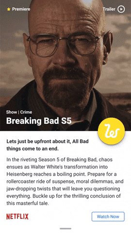
Users received alerts like: "Breaking Bad is now available on Netflix India" or "The Dark Knight is airing on Star Movies tonight at 9pm." Each notification had a distinctive, recognizable sound — users knew immediately it was Watchlyst. It created a signal-based return mechanism rather than hoping for habitual opens.
5. Event Discovery — The Differentiator
The feature no competitor had. Live events, comedy shows, exhibitions, theater — discoverable alongside your Netflix queue. Hyper-local, location-aware, time-sensitive. Nothing else in the market combined digital content with live experiences.
6. Social Layer
Share what you're watching. See what friends saved. Spark conversations. Our organic growth engine before we had budget for paid acquisition.


Card Design Evolution
India was at an inflection point. Netflix entered in January 2016. Hotstar, Voot, ALTBalaji, Sony LIV, ZEE5 were all fighting for attention. YouTube already had 100M+ Indian users. Jio was coming.
The streaming industry spent everything on content acquisition. Nobody spent anything on content discovery. That gap was the opportunity.
Every existing solution was platform-specific or genre-specific. IMDb rated movies. JustWatch tracked availability. Nothing aggregated OTT + TV + live venues into a single, opinionated, personalised feed. Users didn't want a list. They wanted a recommendation - something that felt like a smart friend saying "you'll love this, and it's on Hotstar right now."
We validated this before writing a line of code: 40+ informal interviews over three weeks, guerrilla observation watching people navigate multiple apps in real time, a full competitive teardown of every existing solution. The pattern was clear. The problem was real.
We were right about the problem. We were wrong about timing.

Notification card — our retention engine

App in Motion — Interaction Prototypes
Search card expand animation — the key micro-interaction


Initial Versions and Testing
Future Versions and Plans
The design principle was simple: this had to feel like a recommendation companion, not a database.
The consumer app had four pieces:
A swipeable card feed - the binary decisiveness of Tinder, applied to content. Swipe right to save, left to dismiss. Each interaction trained the algorithm. Low-commitment inputs generate high-quality behavioural data faster than any survey. We knew this and built for it.
Cross-platform aggregation: movies, TV shows, OTT content, live events - unified in one feed. The algorithm factored in time of day, location, viewing history, social trends.
A watchlist with memory: save anything, access it across sessions, share it. This was what separated us from a one-time recommendation tool.
Contextual push notifications: "Breaking Bad is now available on Netflix India." "The Dark Knight is airing on Star Movies tonight at 9pm." Users recognised the notification sound before they read it. That's the kind of detail that creates retention.
The card was designed to answer one question: is this worth my time tonight? Poster, title, platform availability, a one-line hook. No ratings clutter, no review aggregates, no genre taxonomy. The hierarchy was stripped to the point where the swipe decision felt instinctive - if you had to pause and read, the card had already failed. That kind of restraint is harder to land than it looks. Every stakeholder conversation was an argument against adding one more field.
05 — The Solution: Admin CMS
06 — Growth & Community Strategy
The consumer app was the visible product. The CMS was the engine. And it was harder to design.
Personalised recommendations at scale required hundreds of API calls per minute, web crawlers refreshing content data continuously, and human editorial judgment on top of algorithmic curation. If the content pipeline broke, the app went empty. If the editorial experience was bad, our writers quit.
Here's the constraint that changed everything: our content contributors were college students without regular laptop access. Standard admin interfaces - designed for desktop power users - were completely wrong for our context.
We designed a mobile-first CMS from scratch. Three distinct roles, each with a purpose-fit interface:
Writer - content creation and tagging. Fully mobile-optimised. Minimum fields, maximum speed. Built for someone submitting content between classes on a phone.
Editor - review, fact-checking, SEO tagging, linking related content. The quality gate. Could reject or request revisions.
Publisher - final approval, scheduling, push notification triggers. Had visibility into content performance and distribution analytics.
Writers kept producing while editors reviewed in parallel while publishers controlled the schedule. No bottlenecks. The pipeline ran.
That was a non-obvious problem most startups never face. We solved it by designing for the actual user, not the assumed one.
07 — Traction & What the Numbers Said
I was the only designer on the founding team. Consumer app, CMS, every UX decision, user research, product roadmap. My co-founder owned marketing and sales. Our developer owned the stack. The division was clean.
The swipe mechanic. The choice between a card feed and a list wasn't obvious in 2015. Lists are structured, browsable, predictable. Swipe is committal — each card forces a binary decision. We chose swipe because low-commitment inputs generate high-quality behavioural data faster than any survey, and because the instinctive quality of the gesture matched what we wanted: a recommendation that felt like a gut call, not a research task.
This was before Reels. Before Shorts. The gesture pattern we were building - swipe through a personalised, ranked feed of things you either want or don't - became the dominant interaction model for entertainment in the years that followed. We evolved toward the reels pattern before reels existed. At the time, it felt like a product instinct. In hindsight, it was market timing that was right about the mechanic and early on the delivery window.
The card design. Every stakeholder conversation was an argument for adding one more field. Genre. Runtime. Ratings aggregate. We cut all of it. One question: is this worth my time tonight? Poster, title, platform, one-line hook. If you paused to read, the card had already failed. That kind of restraint is harder than it looks - not just as a design decision, but as a political one. Holding a minimalist position in a room where everyone has additions is its own skill.
Micro-interactions and navigation. The session data was doing something unusual: users were averaging 2.5 minutes in an app that had no social layer, no community, no reason to linger beyond discovery. That signal came from the interaction quality - swipe feel, notification timing, transition animations, the small moments that accumulate into product texture. We treated delight as a product principle, not a finishing touch. Simplified navigation so that the card feed was always one tap away. No buried menus, no onboarding ceremony. The product was the feed.
The Instagram channel. The 8,000-follower account with 40-60% engagement was also mine. Not a marketing channel - a design decision about how an entertainment product should sound. We sounded like humans, not a product. Specific titles, specific moods, specific nights. Comments and DMs told us what users wanted before we had enough in-app data to see the pattern. We understood the product's voice on Instagram first. We never fully translated it into the in-app experience.
The Hindi focus. A deliberate call, not a retreat. The Hindi-speaking belt was the largest addressable entertainment audience in India and dramatically underserved by OTT in 2016. Our editorial team - writers and movie buffs from Hindi-speaking states - understood Bollywood instinctively: release cycles, directors, regional distribution. Trying to cover Tamil or Telugu cinema at the same depth would have been editorial overreach. Watchlyst still recommended world cinema, festival films, live events, gigs. Hindi was the centre of gravity. Everything else orbited it.
08 — The Failure Autopsy
09 — What I Would Do Differently
Three things broke the business. All three were avoidable in hindsight.
We were too early. In 2016, India's OTT influx was still relatively low. The paradox of choice we'd identified wasn't acute enough for mainstream users to seek a dedicated solution. Jio hadn't launched. The content explosion we'd anticipated was 12-18 months from becoming a genuine mass pain point. We built infrastructure for a problem that hadn't fully arrived.
Timing failures in entertainment are particularly punishing because you can't hold your position while you wait. You run out of money, the team fragments, the window closes - and when the market finally matures, you're not in it. We identified a real problem. The problem became undeniably mass-scale about two years after we shut down. Both things are true simultaneously, and that's the part that's hardest to explain to people who weren't there.
We perfected the product and ignored the business. The app got enormous care. The business did not. We had a monetisation model - contextual sponsored cards, platform partnerships, event ticketing commissions. We never pressure-tested it with actual partners. We told ourselves: first get users, then get revenue conversations. That sequencing cost us everything.
The correct test would have been simple: take the model to one OTT platform with our 50K download number and see what the conversation looked like. It would have told us immediately whether the business was fundable or theoretical. We avoided that test. Founders avoid it because a failed test destroys the story you're telling yourself. But that's exactly why you run it early - while there's still time to change the model, not after the team has started leaving.
We chased the wrong tangent. We explored IoT devices - hardware that could change TV channels directly from Watchlyst. Exciting idea. Completely wrong for a bootstrapped team with limited engineering resources. We spent months on a hardware exploration that should have gone into retention strategy. We never solved the daily habit problem. The notification system brought users back on a specific trigger, but we never built a strong enough reason to open the app unprompted. Discovery is episodic. Habit requires a consistent daily hook. We never closed that gap.
There's a structural pattern here that shows up in consumer entertainment products repeatedly: triggered engagement looks like retention on a dashboard, but it isn't. A notification fires, the session happens, the user leaves. The next session waits for the next trigger. What we needed was a reason to open the app without being prompted - a social layer (what are friends saving this week?), a recurring anchor (new releases every Friday), something that created its own pull. We had the trigger. We never built the gravity.
The founding team also fell apart in sequence. My co-founder's area was monetisation and business development - exactly the path forward we couldn't find together. Our founding developer left in a dispute. Our sales and marketing person followed. We ran the show for 8-9 months after. You can sustain a lot on stubbornness. You can't build a business on it.
10 — What This Failure Unlocked
Watchlyst failed as a business. It worked as an education.
Before it, I was a designer. After it, I was a product person who happened to be a good designer. That distinction matters more than most people realise.
Every product decision since - launching Airtel Thanks 2.0 to 100M+ users, shipping AI features used by millions in Excel, building design systems across five product teams - has been shaped by what I learned watching Watchlyst fail.
I stopped being precious about design and started being practical about outcomes. I started treating GTM strategy and monetisation as design problems, not someone else's problem. I learned, in visceral detail, what every function on a team actually does - because I was doing all of them at once.
That's not a consolation prize. That's the actual value.
11 — Conclusion
Concerns: